
How to Create and Use XY Line Charts with Examples
In this guide, we’ll show you what an XY line chart is and why it’s ideal for numeric, scientific, or measurement-based data. You’ll also learn how to create your own XY line chart instantly with ChartGo to explore patterns and relationships in precise detail. XY line charts use numeric values on both axes, making them perfect for showing how one variable responds to another. What patterns emerge when you connect your data points across a true numeric scale?

What is an XY Line Chart?
An XY line chart plots data using numeric values on both the X-axis and Y-axis, making it ideal for scientific, financial, or measurement-based datasets. Each point sits at precise coordinates, and the connecting line helps reveal how one variable responds to another.
In simple terms, it’s similar to a line chart but with true numeric scaling. This allows you to explore patterns such as speed over distance, temperature over time, or any relationship where accuracy along both axes matters. XY line charts bring clarity to detailed, data-driven analysis.
Try This XY Line Chart Example in ChartGo
Create a New XY Line Chart
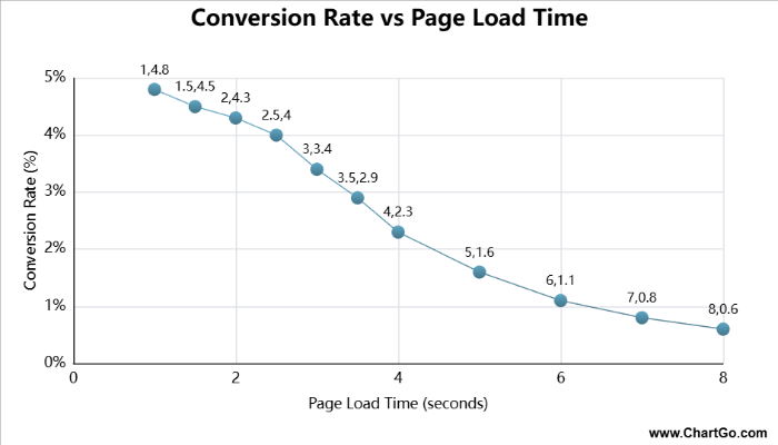
This XY line chart shows how a website’s conversion rate changes as page load time increases. Each point represents the average results from performance tests across thousands of sessions. The pattern is far from linear: conversions stay strong between 1–2 seconds, begin to drop sharply at 3–4 seconds, and then fall dramatically once load times exceed 5 seconds. By the time a page takes 8 seconds to load, conversion rates are more than 70% lower. This type of chart is ideal for demonstrating the real business impact of performance, and why speed optimization remains one of the highest-ROI improvements for digital teams.
When to Use an XY Line Chart
XY line charts are ideal when you want to show how one numeric variable changes in relation to another. With precise positioning on both axes, they reveal relationships, reactions, and patterns that depend on exact values.
For example, if you’re analyzing speed over distance, temperature over time, or scientific measurements, an XY line chart shows the shape and direction of the relationship clearly. It’s designed for accuracy and is commonly used in technical, financial, or engineering data.
Use an XY line chart when you want to answer questions like:
- How does one value respond as another changes?
- Is there a clear upward or downward pattern?
- Where do sharp increases, plateaus, or turning points occur?
- How strong or consistent is the relationship across the data?
If your goal is to emphasize precision and numeric scaling, an XY line chart is the best choice. But if your data is purely time-based, a standard line chart may be more intuitive for most viewers.
Create and Customize Your Own XY Line Chart
With ChartGo, you don’t just learn what an XY line chart is, you actually build one yourself. Enter your numeric X and Y values, adjust the series and instantly see how the plotted line changes. It’s the most effective way to understand relationships between variables.
You can fully customize the visual presentation: choose the point shape, adjust the line thickness, switch between solid or dashed styles, select custom colours, and even turn on a trend line for deeper insights. Each change updates the chart in real time, helping you explore patterns with accuracy and clarity.
Customize Line Chart Example
Create a New XY Line Chart
So don’t just read about XY Line charts, build and modify them. You’ll quickly see how every small change helps tell a clearer data story.
Examples of XY Line Charts in Action
XY line charts reveal relationships between two numeric variables. They’re ideal for scientific, experimental, and analytical data where the goal is to observe patterns, curves, growth limits, or decay effects. Here are three clear scientific examples that demonstrate how XY charts bring data relationships to life.
1. Enzyme Activity vs Temperature
A classic bell-shaped curve showing how enzymes perform best at an optimal temperature, then lose activity as they overheat.
2. Light Intensity vs Distance
Demonstrates the inverse-square law in physics, where intensity drops rapidly as distance increases.
3. Logistic Population Growth
An S-shaped curve showing slow initial growth, rapid expansion and eventual leveling at carrying capacity.
Enzyme Activity vs Temperature – XY Line Chart
By Alana

This XY line chart shows how enzyme activity changes as temperature increases.
Activity rises steadily, reaches its peak near 37°C, and then drops sharply as excessive heat
begins to denature the enzyme.
Light Intensity vs Distance – XY Line Chart
By Josie

This chart illustrates the inverse-square law of physics.
Light intensity drops dramatically with even small increases in distance, then gradually levels off,
forming a smooth decay curve.
Logistic Population Growth – XY Line Chart
By Josie
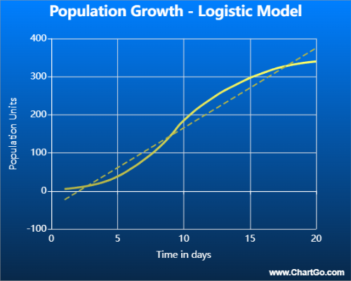
This XY line chart shows classic logistic growth.
The population starts small, accelerates rapidly during the exponential phase,
and eventually levels off as it approaches its environmental limit.
Expert Tips from the ChartGo Team
XY line charts are powerful tools for visualizing precise numeric relationships. Here are our expert tips to help you get the most out of your XY line visuals:
- Use accurate scaling: Since both axes are numeric, make sure your X and Y ranges reflect the true structure of the data. Proper scaling prevents distortions and keeps patterns honest.
- Choose the right point shape: Circles and diamonds offer clarity for dense datasets, while squares or triangles can highlight key measurement points.
- Control line style: Use solid lines for continuous data and dashed styles for projections or alternate scenarios. The right style helps define how the viewer should interpret the data.
- Leverage trend lines: When exploring correlations or direction, a trend line helps reveal the underlying pattern that might not be obvious from raw points alone.
- Avoid mixing incompatible scales: XY line charts demand consistency. Don’t force unrelated variables onto the same view unless they truly share a meaningful relationship.
Remember: An XY line chart is about precision and relationships. With ChartGo, you can adjust every detail—from point shapes to colours to line styles— allowing your chart to tell a clear and accurate story of how your variables interact.