
Graphs vs Charts: Understanding the Difference
People often use the words graph and chart interchangeably, but they don’t mean exactly the same thing. This short gide explains what makes a chart different from a graph, when to use each and how ChartGo helps you create both with just a few clicks.

What Is a Chart?
A chart is a general visual representation of data. It organizes values into categories or proportions to make them easy to understand. Charts are perfect for comparing groups, showing parts of a whole, or summarizing large datasets visually.
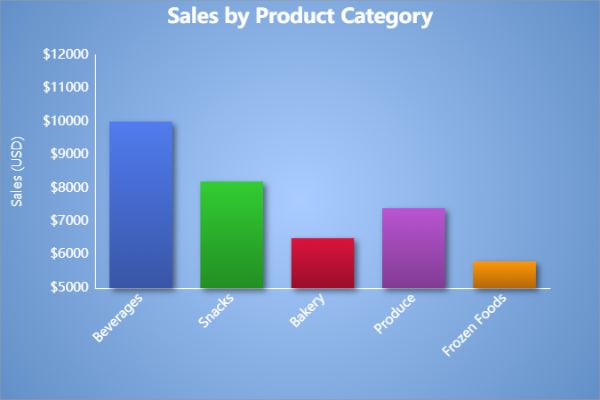
In this example, each bar represents a product category. The goal is to compare categories, not show relationships — that’s why this is called a chart, not a graph.
What Is a Graph?
A graph shows the relationship between two numeric variables — one on the X-axis and the other on the Y-axis. Each point on a graph represents a pair of values, helping you see how one variable changes in relation to another. Graphs are ideal for revealing patterns, trends, and correlations in numeric data.
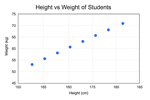
In this example, each dot represents a student’s height and weight. The upward trend shows that as height increases, weight also tends to increase. This visual relationship between two numeric variables is what makes this a graph rather than a chart.
When to Use a Chart vs a Graph
- Use a chart when comparing categories, totals, or parts of a whole (e.g., sales by region, budget breakdown).
- Use a graph when showing how values change or relate to one another (e.g., temperature vs time, cost vs production).
Both tools make data easier to understand but charts help you compare, while graphs help you analyze. Knowing the difference makes your data story clearer and more effective. One trick we always use it that if yor x and y values are only numeric, you will like need a graph. If you have a mix of categorical and numeric values, you will like need a chart.
Do People Use “Graph” and “Chart” Interchangeably?
Yes, especially in everyday use. In business, education, and even many software tools, “chart” and “graph” are often treated as the same thing. You might hear someone say “bar graph” or “sales chart” and both describe the same kind of visual.
At ChartGo, we recognize the distinction graphs show numeric relationships, while charts focus on comparisons and composition but we also embrace how most people naturally use the terms. What matters most is helping you communicate your data clearly.
Quick Comparison: When to Use a Chart or a Graph
Here’s a simple overview to help you decide which one fits your data best. Charts are perfect for comparisons and summaries, while graphs excel at showing numeric relationships and change.
| Feature | Chart | Graph |
|---|---|---|
| Main Purpose | Compare categories or show parts of a whole | Show relationships or changes between numeric variables |
| Data Type | Categorical (e.g., products, regions) | Numeric (e.g., time, measurements) |
| Common Examples | Bar, Pie, Area, Column, Line | Line, Scatter, Bubble |
| Best For | Summarizing and comparing totals or proportions | Analyzing trends, movement, and correlations |
| Axes | May use one or none | Always uses X and Y numeric axes |
| Audience Use | Business reports, dashboards, presentations | Scientific data, performance analysis, statistics |
Still not sure which one to use? Visit our Chart Types Guide to explore both categories in more detail.