
How to Create and Use Line Charts with Examples
In this guide, we’ll show you what a line chart is and when it makes sense to use one. More importantly, we’ll help you create your own line chart instantly with ChartGo so you can explore your data as you learn. Line charts are all about trends and movement. How values rise, fall or stay steady over time. What story does your data tell when you connect the points?

What is an Line Chart?
A line chart is one of the simplest and most powerful ways to visualize data that changes over time. Each point represents a value, and the line connecting those points helps you see patterns, growth, and dips clearly.
In simple terms, it’s like connecting the dots to reveal your data’s story. You can quickly see Whether sales are rising, temperatures are changing or check your evolving website's traffic. Line charts make it easy to see how one value moves relative to another, helping you notice trends at a glance.
Try This Line Chart Example in ChartGo
Create a New Line Chart
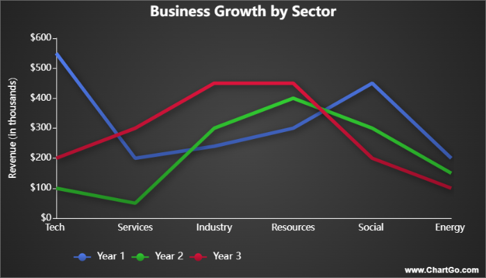
For example, if you wanted to compare how different business sectors performed over several years, a line chart would instantly reveal which ones grew, declined or stayed steady all at a glance. This would be extremely beneficial for decision making, because you could see how business are doing and make decisions based on the line chart.
When to Use a Line Chart
Line charts are best when you want to show trends, patterns or changes over time. They make it easy to see direction. Whether values are rising, falling or staying steady, they help reveal relationships between datasets.
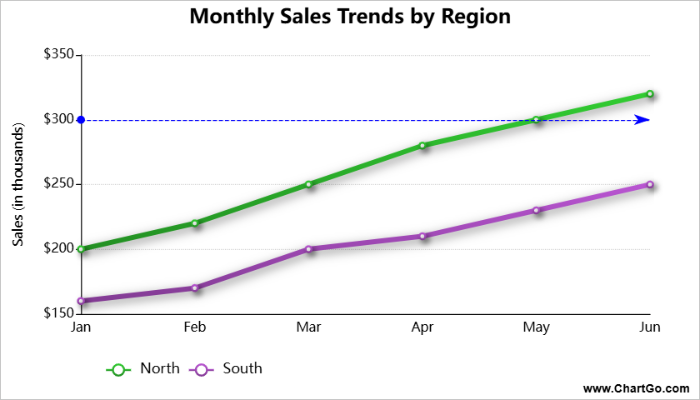
For example, if you’re comparing sales across several years or tracking website traffic from different sources, a line chart lets you instantly see how one group’s performance moves relative to another. You can spot growth, declines, and crossovers at a glance.
Use a line chart when you want to answer questions like:
- How has this value changed over time?
- Are two or more groups moving in the same direction?
- When did a trend start to rise or fall?
- How fast or steady is the rate of change?
If your goal is to emphasize the shape of the trend or the speed of change, a line chart is the best choice. But if you also want to show the total volume beneath those lines, an area chart might be a better fit.
Create and Customize Your Own Line Chart
Most guides only explain what a line chart is. With ChartGo, you actually get to try it yourself. Change the data, add more series, adjust the style, and instantly see how your chart updates in real time.
This is the best way to truly understand how line charts behave. Instead of just looking at static images, you can watch the lines shift as you change the numbers. Its a convenient quick, visual way to learn what your data is saying. You can customize line colours, thickness, markers, and style to match your project or presentation. Want clean, simple lines for a report? Or bright colours for a classroom demo? It’s all just a few clicks away.
Customize Line Chart Example
Create a New Line Chart
So don’t just read about line charts, build and modify them. You’ll quickly see how every small change helps tell a clearer data story.
Examples of Line Charts in Action
Sometimes the best way to understand line charts is to see them in motion. Here are a few simple examples of how line charts can clearly show trends, growth, and changes over time.
1. Website Traffic Over a Month
Track how daily website visits rise and fall. The line’s slope makes it easy to spot growth periods, dips, or sudden spikes in activity.
2. Product Sales Over Seasons
Compare how different products perform through the year.
Line charts help you see which items peak in summer or drop in winter. They're perfect for spotting seasonal demand.
3. Temperature Changes Throughout the Day
Show how temperature fluctuates from morning to night.
The gradual curves of a line chart make it clear how quickly or slowly conditions change over time.
Website Traffic Over a Month – Line Chart
By Josie
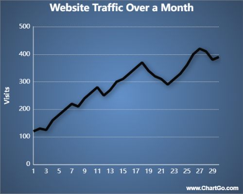
This line chart tracks daily website visits for a month.
It’s perfect for spotting peaks in activity and slower days at a glance.
The smooth line makes it easy to see how traffic grows, dips, and recovers across the month.
Product Sales Over Seasons – Line Chart
By Alana
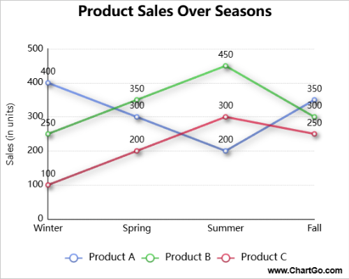
Compare how product sales change throughout the year.
This multi-series line chart shows how each product type peaks or dips depending on the season. Its a
a great way to visualize seasonal demand or shifting customer habits.
Temperature Through the Day – Line Chart
By Josie
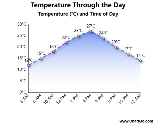
This line chart shows how temperature shifts from early morning to late evening.
The smooth curve helps you visualize warming and cooling patterns throughout the day.
Its ideal for environmental, educational, or energy-related data.
Expert Tips from the ChartGo Team
Over the years, we’ve seen thousands of people use ChartGo to visualize patterns and trends. Here are a few expert tips from our team to help you make your line charts stand out:
- Focus on trends, not clutter: Avoid adding too many lines. Two or three data series are usually enough to keep the story clear and easy to follow.
- Highlight changes: Use colour and markers to draw attention to key moments such as peaks, drops or intersections between lines.
- Stay consistent: If you’re comparing multiple charts, use the same scale and line colours so viewers can quickly spot differences.
- Label smartly: Use clear axis labels and a descriptive title. Good labeling ensures your chart makes sense even without extra context.
- Keep it smooth: Smooth lines often make continuous data easier to read, but don’t overdo it. Use sharp angles when you need to emphasize sudden changes.
Remember: Line charts aren’t just about data points, they’re about stories in motion. A well-designed line chart helps your audience instantly see what’s changing, what’s stable and why it matters. With ChartGo, you can fine-tune every detail until your message flows as clearly as your lines.