
So erstellen und verwenden Sie Kreisdiagramme mit Beispielen
In dieser Anleitung erklären wir, was ein Kreisdiagramm ist und wann es sinnvoll ist, eines zu verwenden. Wir helfen Ihnen auch dabei, Ihr eigenes Kreisdiagramm sofort mit ChartGo zu erstellen damit Sie visualisieren können, wie jede Kategorie zum Ganzen beiträgt. Kreisdiagramme eignen sich ideal zur Darstellung von Anteilen, Prozentsätzen und einfachen Vergleichen zwischen Kategorien. Wie sieht Ihre Daten aus, wenn jeder Abschnitt seinen Anteil am Ganzen offenbart?

Was ist ein Kreisdiagramm?
Ein Kreisdiagramm ist ein kreisförmiges Diagramm, das in Abschnitte unterteilt ist, wobei jeder Abschnitt den Anteil einer Kategorie am Gesamten darstellt. Es ist eine einfache und effektive Möglichkeit, Anteile, Prozentsätze und den Beitrag verschiedener Teile zu einem Ganzen darzustellen.
In einfachen Worten beantwortet ein Kreisdiagramm eine Frage: „Wer bekommt welchen Teil vom Kuchen?“ Ob Sie Marktanteile, Budgetverteilung oder Umfragedurchbrüche darstellen, Kreisdiagramme erleichtern den Vergleich von Kategorien auf einen Blick.
Dieses Kreisdiagramm-Beispiel in ChartGo ausprobieren
Neues Kreisdiagramm erstellen
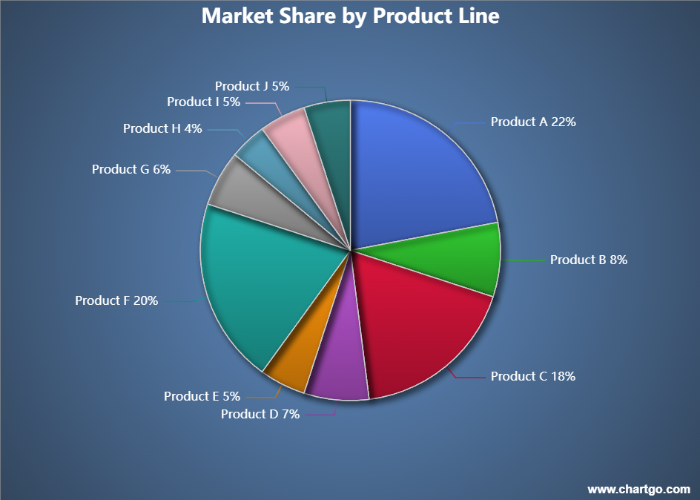
Dieses Kreisdiagramm illustriert die Marktanteilsverteilung über zehn verschiedene Produktlinien innerhalb eines Konsumgüterunternehmens. Jeder Abschnitt repräsentiert den Prozentsatz des Gesamtumsatzes, der von dieser Kategorie generiert wird. Wie das Diagramm zeigt, treiben Produkt A, Produkt C und Produkt F den Großteil des Umsatzes des Unternehmens an, während kleinere Produktlinien bescheidene, aber stabile Anteile beitragen. Kreisdiagramme eignen sich ideal, um dominante Kategorien schnell zu enthüllen und Bereiche zu identifizieren, in denen Wachstumschancen bestehen könnten.
Wann ein Kreisdiagramm verwenden
Kreisdiagramme sind am besten geeignet, wenn Sie zeigen möchten, wie jede Kategorie zum Gesamten beiträgt. Sie erleichtern den Vergleich von Anteilen, Prozentsätzen und relativen Größen auf einen Blick.
Zum Beispiel, wenn Sie Marktanteile, Budgetzuweisungen oder Umfrageantworten visualisieren, hebt ein Kreisdiagramm hervor, welche Segmente dominieren, welche kleiner sind und wie alles zusammenpasst. Es ist perfekt für einfache Vergleiche, die Teile eines Ganzen betonen.
Verwenden Sie ein Kreisdiagramm, wenn Sie Fragen beantworten möchten wie:
- Welchen Prozentsatz stellt jede Kategorie dar?
- Welches Segment ist das größte oder kleinste?
- Wie vergleichen sich zwei oder mehr Abschnitte in der Größe?
- Wie sieht die Gesamtverteilung aus?
Wenn Ihr Ziel darin besteht, Anteile oder Zusammensetzung hervorzuheben, ist ein Kreisdiagramm die beste Wahl. Aber wenn Sie Werte präzise vergleichen oder viele Kategorien darstellen müssen, kann ein Balkendiagramm die Informationen effektiver vermitteln.
Erstellen und Anpassen Ihres eigenen Kreisdiagramms
Statt nur über Kreisdiagramme zu lesen, lässt ChartGo Sie direkt mit einem interagieren. Geben Sie Ihre Kategorien ein, aktualisieren Sie die Werte, und sehen Sie, wie sich die Abschnitte sofort anpassen. Es ist der schnellste Weg, um zu verstehen, wie sich Anteile verschieben, wenn sich Ihre Daten ändern.
Sie können auch den visuellen Stil anpassen: Machen Sie aus Ihrem Kreis ein Ringdiagramm, zeigen Sie Prozentsätze an oder aktivieren Sie abgerundete Ecken und dicke Rahmen für ein sauberes, modernes Aussehen. Ob Sie ein klassisches Kreisdiagramm oder ein stilisiertes Präsentationsgrafik wünschen, ChartGo gibt Ihnen volle Kontrolle mit nur wenigen Klicks.
Kreisdiagramm-Beispiel anpassen
Kreisdiagramm erstellen
Lesen Sie also nicht nur über Kreisdiagramme, erstellen und modifizieren Sie sie. Sie werden schnell sehen, wie jede kleine Änderung hilft, eine klarere Datengeschichte zu erzählen.
Beispiele für Kreisdiagramme in Aktion
Kreisdiagramme eignen sich perfekt, um zu zeigen, wie jede Kategorie zu einem Ganzen beiträgt. Sie sind ideal, wenn Sie Anteile vergleichen, dominante Segmente hervorheben oder eine einfache Geschichte über die Verteilung auf einen Blick erzählen möchten. Hier sind drei unterhaltsame Beispiele, die zeigen, wie Kreisdiagramme alltägliche Daten zum Leben erwecken.
1. Lieblingseiscreme-Geschmäcker
Sehen Sie, welche Geschmäcker in einer kleinen Umfrage am beliebtesten sind.
Ein Kreisdiagramm macht es einfach, zu erkennen, welche Geschmäcker dominieren und welche Nischenfavoriten sind.
2. Streaming-Dienst-Zuschauzeitanteil
Vergleichen Sie, wie viel Zeit die Menschen in einem typischen Monat bei verschiedenen Streaming-Plattformen verbringen.
Die Abschnitte enthüllen, welche Dienste wirklich die Aufmerksamkeit der Zuschauer fesseln.
3. Haustierbeliebtheit im Viertel
Visualisieren Sie, welche Haustiere Haushalte am häufigsten besitzen.
Dieses Beispiel zeigt, wie ein Kreisdiagramm einfache Umfragezahlen in ein klares, einprägsames Bild verwandeln kann.
Lieblingseiscreme-Geschmäcker - Kreisdiagramm
Von Josie
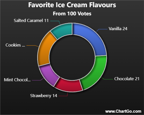
Dieses Kreisdiagramm zeigt, welche Eiscreme-Geschmäcker in einer kleinen Gruppenumfrage am beliebtesten sind.
Einige klassische Geschmäcker dominieren das Diagramm, während andere kleinere, aber loyale Vorlieben ausmachen.
Es ist ein einfaches, unterhaltsames Beispiel dafür, wie Kreisdiagramme dominante Kategorien auf einen Blick enthüllen.
Streaming-Dienst-Zuschauzeit - Kreisdiagramm
Von Alana
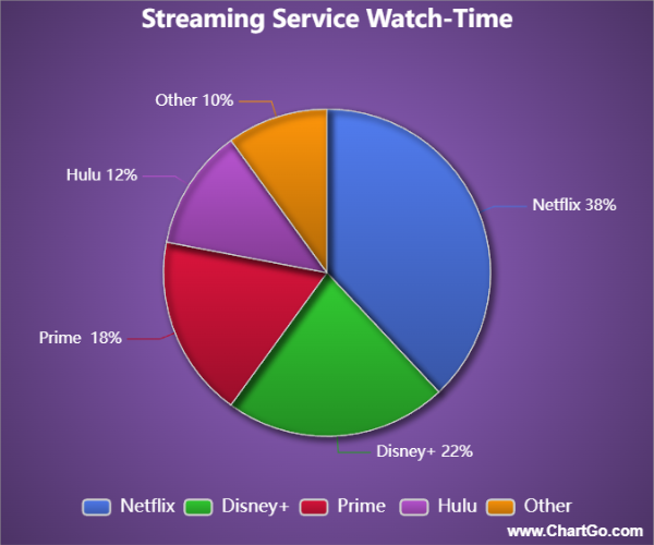
Dieses Kreisdiagramm vergleicht die monatliche Zuschauzeit über verschiedene Streaming-Dienste.
Eine Plattform führt klar, während andere kleinere, aber immer noch signifikante Anteile der Zuschauzeit teilen.
Es ist ein großartiges Beispiel dafür, wie Kreisdiagramme schnell vermitteln können, wohin die Aufmerksamkeit wirklich geht.
Haustierbeliebtheit im Viertel - Kreisdiagramm
Von Josie
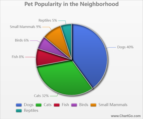
Dieses Kreisdiagramm zeigt, wie häufig verschiedene Haustiertypen in einer Viertelumfrage vorkommen.
Hunde und Katzen nehmen den Großteil des Diagramms ein, während kleinere Abschnitte Fische, Vögel,
kleine Säugetiere und Reptilien darstellen. Es ist eine freundliche, nachvollziehbare Art, geteilte Interessen zu zeigen.
Expertentipps vom ChartGo-Team
Nach Jahren der Beobachtung, wie Nutzer Kreisdiagramme erstellen, haben wir gelernt, was ein Kreisdiagramm klar, wirkungsvoll und leicht lesbar macht. Hier sind unsere besten Tipps für die Erstellung toller Kreisvisualisierungen:
- Verwenden Sie eine begrenzte Anzahl an Abschnitten: Kreisdiagramme funktionieren am besten mit 4–6 Kategorien. Zu viele Abschnitte machen das Diagramm unübersichtlich und verringern die Lesbarkeit.
- Heben Sie Schlüsselabschnitte hervor: Verwenden Sie Farbkontraste oder die „Prozentsatz“-Funktion, um die wichtigsten Kategorien zu betonen. Ihre Botschaft wird so leichter auf einen Blick verständlich.
- Überlegen Sie ein Ring-Stil: Ringdiagramme verbessern oft die Lesbarkeit, indem sie den Fokus auf den Ring legen, nicht auf die Mitte. Sie bieten auch Platz für Beschriftungen oder Symbole, falls nötig.
- Ordnen Sie Abschnitte logisch an: Sortieren Sie Abschnitte nach Wert, von groß nach klein, oder gruppieren Sie ähnliche Kategorien zusammen. Das hilft Nutzern, das Diagramm schneller zu interpretieren.
- Verwenden Sie abgerundete Ecken und dicke Rahmen gezielt: Diese Designoptionen verleihen ein modernes Aussehen, sollten aber sparsam eingesetzt werden, wenn Klarheit oberste Priorität hat.
Denken Sie daran: Ein Kreisdiagramm geht um Teile eines Ganzen. Gut gestaltet enthüllt es sofort, welche Segmente wichtig sind und wie sie zueinander stehen. ChartGo macht es einfach, Farben, Stile und Beschriftungen anzupassen, damit Ihr Kreisdiagramm klar und schön kommuniziert.