
Comment Créer et Utiliser des Graphiques Combinés avec des Exemples
Dans ce guide, nous expliquerons ce qu'est un graphique combiné et quand combiner des types de graphiques rend vos données plus claires. Plus important encore, nous vous aiderons à créer votre propre graphique combiné instantanément avec ChartGo afin que vous puissiez comparer différentes séries de données sur une seule visualisation puissante. Les graphiques combinés vous permettent de mélanger barres, lignes et aires pour mettre en évidence les relations, les contrastes et les tendances en un seul endroit. Quels insights apparaissent lorsque vous combinez des types de graphiques au lieu d'en choisir un seul ?

Qu'est-ce qu'un Graphique Combiné ?
Un graphique combiné vous permet d'afficher deux types de graphiques différents ensemble. Le plus courant est un graphique en barres et un graphique en ligne. En combinant des styles, vous pouvez comparer différents types de données en un seul endroit et mettre en évidence les contrastes ou les relations plus clairement.
En termes simples, c'est une façon visuelle de montrer comment deux histoires de données liées interagissent. Vous pourriez suivre les ventes avec des barres tout en montrant le taux de croissance avec une ligne, ou comparer des totaux avec des tendances en une seule vue. Les graphiques combinés rendent les comparaisons complexes intuitives et faciles à interpréter.
Essayez Cet Exemple de Graphique Combiné dans ChartGo
Créez un Nouveau Graphique Combiné
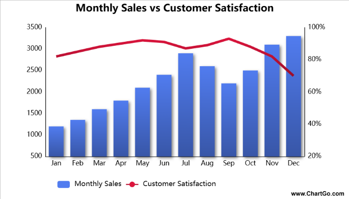
Ce graphique combiné compare le volume des ventes mensuelles avec les scores de satisfaction client sur l'année. Les barres montrent le nombre total d'unités vendues chaque mois, tandis que la ligne révèle comment les clients ont évalué leur expérience sur une échelle de 1 à 100. Cet exemple met en évidence un motif courant dans les affaires : les mois de ventes fortes ne correspondent pas toujours à une satisfaction plus élevée. Remarquez comment juillet et novembre ont des pics de ventes mais une satisfaction légèrement plus faible en raison de la demande accrue et de la pression sur le support client. Ce type de graphique est idéal pour comprendre comment les performances opérationnelles affectent le sentiment client au fil du temps.
Quand Utiliser un Graphique Combiné
Les graphiques combinés sont idéaux lorsque vous voulez comparer deux types différents de données sur une seule visualisation. En combinant des séries en barres, lignes ou aires, vous pouvez montrer des totaux à côté de tendances, ou des comparaisons directes à côté de taux de croissance.
Par exemple, vous pourriez afficher les revenus mensuels avec des barres tout en superposant une ligne qui montre la croissance d'une année sur l'autre. Ou utiliser des barres pour le volume et une ligne pour mettre en évidence les moyennes ou les benchmarks. Un graphique combiné vous permet de communiquer deux histoires en une seule visualisation claire.
Utilisez un graphique combiné lorsque vous voulez répondre à des questions comme :
- Comment les totaux réels se comparent-ils aux tendances ou aux taux ?
- Deux ensembles de données liés évoluent-ils ensemble ou divergent-ils ?
- Comment une métrique influence-t-elle ou explique-t-elle une autre ?
- Quelle visualisation aide à mettre en évidence l'insight principal, les barres ou les lignes ?
Si votre objectif est de mettre en évidence les relations entre ensembles de données ou de montrer les contrastes plus clairement, un graphique combiné est le meilleur choix. Lorsque un seul type de graphique ne suffit pas à raconter toute l'histoire, une approche combinée apporte de la clarté.
Créez et Personnalisez Votre Propre Graphique Combiné
La plupart des guides expliquent ce qu'est un graphique combiné, mais avec ChartGo vous pouvez en construire un vous-même. Sélectionnez deux types de graphiques différents, comme barres et lignes, ajustez les données pour chaque série et regardez votre graphique combiné se mettre à jour instantanément.
Cette approche pratique vous permet de voir comment chaque type de graphique contribue à l'histoire. Changez les plages de l'axe Y, ajoutez des titres, modifiez les intervalles ou passez entre les styles barres, lignes et aires. Chaque série a ses propres paramètres, afin que vous puissiez matcher la mise en forme, les couleurs et l'échelle indépendamment. Que vous montriez des totaux avec des barres et des tendances avec une ligne, ou que vous compariez des motifs à travers deux métriques, ChartGo rend la personnalisation des graphiques combinés rapide et intuitive.
Personnaliser l'Exemple de Graphique Combiné
Créez un Nouveau Graphique Combiné
Ne lisez donc pas seulement sur les graphiques combinés, construisez et modifiez-les. Vous verrez rapidement comment chaque petit changement aide à raconter une histoire de données plus claire.
Exemples de Graphiques Combinés en Action
Les graphiques combinés combinent deux styles de visualisation, comme des barres avec des lignes ou des barres avec des aires, ce qui les rend idéaux pour les données scientifiques où deux mesures liées évoluent ensemble mais sur des échelles différentes. Ils sont puissants lorsque vous voulez comparer la magnitude (barres) et la tendance (ligne ou aire) en une seule vue. Voici trois exemples scientifiques qui démontrent comment les graphiques combinés révèlent des motifs que vous pourriez autrement manquer.
1. Précipitations vs Débit de Rivière
Ce graphique combine les précipitations mensuelles (barres) avec le débit de la rivière (ligne), montrant comment les précipitations
influencent les niveaux d'eau tout au long de l'année.
2. Heures d'Ensoleillement vs Croissance des Plantes
Un graphique combiné comparant la durée d'ensoleillement (barres) et la croissance moyenne hebdomadaire des plantes (ligne)
sur plusieurs semaines, parfait pour les études biologiques ou écologiques.
3. CO₂ Atmosphérique vs Anomalie de Température Globale
Un graphique en barres + aires montrant les niveaux croissants de CO₂ aux côtés des anomalies de température
pour illustrer les motifs à long terme du changement climatique.
Précipitations vs Débit de Rivière - Graphique Combiné
Par Josie
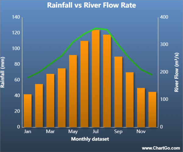
Ce graphique combiné scientifique compare les précipitations mensuelles avec le débit de la rivière.
Les niveaux de précipitations sont affichés en barres, tandis que le débit de la rivière est montré en ligne.
La combinaison rend facile à voir comment les précipitations impactent le comportement de la rivière
tout au long de l'année.
Heures d'Ensoleillement vs Croissance des Plantes – Graphique Combiné
Par Alana
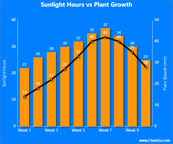
Ce graphique combiné compare les heures d'ensoleillement avec la croissance hebdomadaire des plantes.
Les barres montrent la durée d'exposition au soleil, tandis que la ligne représente la croissance moyenne des plantes.
Il met clairement en évidence comment la croissance biologique répond à l'augmentation ou à la diminution de la lumière.
Niveaux de CO₂ vs Anomalie de Température – Graphique Combiné
Par Josie
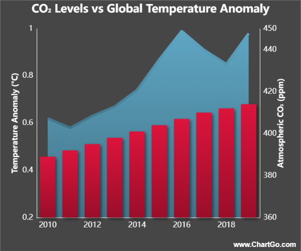
Ce graphique combiné affiche les niveaux atmosphériques de CO₂ aux côtés des anomalies de température globale.
Le CO₂ est montré en barres, tandis que l'anomalie de température est affichée sous forme d'aire.
L'appariement révèle les tendances climatiques à long terme de manière claire et convaincante.
Conseils d'Experts de l'Équipe ChartGo
Après avoir aidé des milliers d'utilisateurs à construire des Graphiques Combinés, nous avons appris ce qui fait fonctionner un graphique mixte et ce qui le rend confus. Voici quelques conseils d'experts pour aider vos graphiques combinés à briller :
- Donnez un objectif à chaque type de graphique : Utilisez des barres pour montrer des totaux ou des volumes, et des lignes pour mettre en évidence des tendances ou des taux. Lorsque chaque visuel joue un rôle clair, votre message devient plus fort.
- Équilibrez les échelles avec soin : Si vos deux séries utilisent des plages de valeurs différentes, ajustez les paramètres de l'axe Y pour que les deux soient lisibles sans submerger le spectateur.
- Utilisez le contraste avec sagesse : Combinez des couleurs ou des styles distincts (par exemple, des barres solides avec une ligne audacieuse) pour que chaque série se distingue sans concurrence visuelle.
- Étiquetez les deux axes : Avec deux types de graphiques à l'écran, des titres d'axe Y clairs, des préfixes et des intervalles sont essentiels. Une bonne étiquetage empêche les spectateurs de mal interpréter les données.
- Ne surchargez pas le graphique : Deux séries suffisent généralement. Ajouter plus de types ou de métriques non liées peut rendre le graphique encombré et plus difficile à comprendre.
Rappelez-vous : Un grand graphique combiné raconte deux histoires liées en une seule visualisation. Avec ChartGo, vous pouvez affiner chaque série barres, lignes ou aires jusqu'à ce que la relation entre elles devienne claire, convaincante et facile à comprendre.