
Entendiendo los Diferentes Tipos de Gráficos
En esta guía, repasaremos los principales tipos de gráficos y exploraremos para qué es mejor cada uno, cuándo usarlo y cómo comunicar tus datos de manera más clara. Cada tipo de gráfico cuenta una historia ligeramente diferente sobre tus datos. Algunos destacan comparaciones, mientras que otros revelan patrones o relaciones. Aprender a asociar tus datos con la visualización adecuada hace que tu mensaje sea más fácil de entender y mucho más poderoso. Ya sea que estés comparando categorías, detectando tendencias o explorando relaciones, esta página te ayudará a elegir el gráfico que mejor se adapte a tu mensaje.

Dos Familias de Gráficos
Cada gráfico encaja en una de dos familias, Categorías o XY. La que elijas depende del tipo de datos que quieras mostrar. Cada familia organiza la información de manera diferente, ayudándote a resaltar el mensaje correcto en tus datos.
- Gráficos de Categorías: Si tus datos usan nombres o etiquetas como meses, departamentos o tipos de productos, estás trabajando con categorías. Estos gráficos se tratan de comparar grupos lado a lado para ver cuál se destaca o cambia más.
- Gráficos XY: Si tus datos se basan en números en ambos ejes como tiempo, distancias o temperatura, entonces pertenecen a la familia XY. Cada punto en el gráfico representa un par de valores numéricos, uno para el eje X y uno para el eje Y. Estos gráficos se tratan de mostrar tendencias, correlaciones o comparaciones entre variables para ver cuál se destaca o cambia más. Te ayudan a detectar patrones o relaciones, como cómo un valor aumenta mientras otro disminuye.
Una vez que sepas a qué familia pertenecen tus datos, será mucho más fácil elegir el tipo de gráfico que se adapte a tu historia.
Ejemplos de Gráficos de Categorías en Acción
Los gráficos de categorías son geniales cuando tus datos están agrupados en nombres o etiquetas, como meses, productos o departamentos. Te ayudan a comparar cómo se desempeña cada categoría lado a lado, haciendo que las diferencias sean fáciles de ver de un vistazo.
- Si tu eje X muestra nombres o etiquetas en lugar de números, estás trabajando con un gráfico de categorías.
- Estos gráficos son perfectos para comparar totales, clasificar elementos o mostrar cómo diferentes grupos se apilan.
- Los tipos comunes incluyen Barras, Pastel, Área y Línea (Categoría).
Gráfico de Barras - Categoría
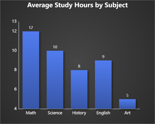
Los gráficos de barras son perfectos para comparar valores entre categorías como ventas por departamento, materias escolares populares o popularidad de productos. Cada barra muestra cómo un grupo se mide contra los demás.
Gráfico de Pastel - Categoría
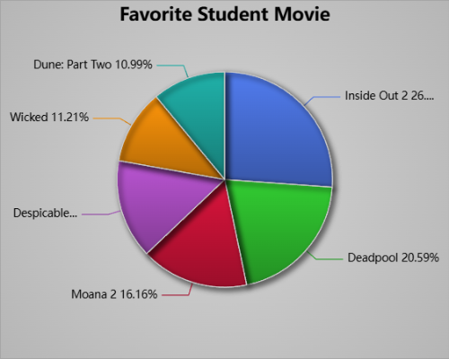
Los gráficos de pastel muestran cómo cada categoría contribuye a un total. Son geniales para visualizar proporciones o porcentajes en tus datos.
Gráfico de Área - Categoría
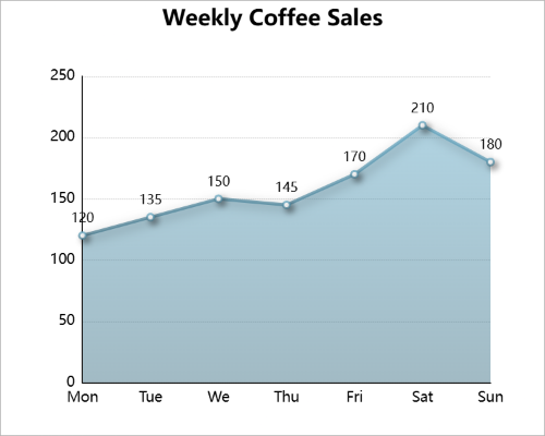
Los gráficos de área son geniales para mostrar cambio gradual a lo largo de días etiquetados. Este ejemplo rastrea tazas de café vendidas durante la semana, con el área sombreada mostrando fines de semana más ocupados y días laborables más lentos.
Ejemplos de Gráficos XY en Acción
Los gráficos XY usan valores numéricos en ambos ejes, ayudándote a explorar relaciones y patrones en datos continuos. Son perfectos para mostrar tendencias, correlaciones o comparaciones entre variables numéricas.
- Si tanto tu eje X como tu eje Y muestran valores numéricos, estás trabajando con un gráfico XY.
- Estos gráficos son ideales para visualizar relaciones, cambio continuo o clusters de datos a lo largo del tiempo.
- Los tipos comunes incluyen Dispersión, Burbuja, Línea, Histograma y Barbell (Mancuerna).
Gráfico de Dispersión (XY)

Los gráficos de dispersión muestran pares de valores numéricos para mostrar cómo se relacionan dos variables. Son geniales para identificar correlaciones o detectar patrones, como cómo una métrica aumenta mientras otra sube.
Gráfico de Burbujas (XY)
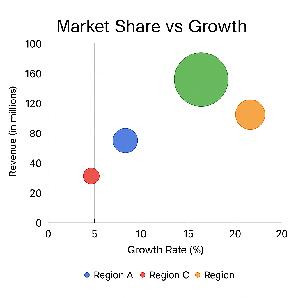
Los gráficos de burbujas extienden los gráficos de dispersión agregando una tercera dimensión con el tamaño de la burbuja. Son perfectos para comparar múltiples variables visualmente, mostrando diferencias de escala o magnitud de un vistazo.
Elegir el Gráfico Correcto
Elegir el gráfico correcto depende de la historia que tus datos necesiten contar. Usa un gráfico de barras o columnas para comparaciones rápidas de categorías, un gráfico de línea para tendencias, o un gráfico de pastel para mostrar proporciones. Cuando estés analizando relaciones entre números, los gráficos XY como dispersión o burbujas son tus mejores amigos.
| Objetivo | Tipo de Gráfico Recomendado | Gráfico |
|---|---|---|
| Comparar categorías | Barras o Columnas | |
| Mostrar composición | Pastel o Donut | |
| Mostrar cambio con el tiempo | Línea o Área, o Combinado | |
| Resaltar cambio entre dos valores | Barbell (Mancuerna) | |
| Mostrar relaciones | Dispersión o Burbuja | |
| Mostrar distribución | Histograma |
Piensa en tus objetivos: comparación, cambio, composición, o relación. Una vez que sepas qué estás tratando de mostrar, el gráfico correcto suele elegirlo por sí solo.
Pruébalo Tú Mismo en ChartGo
La mejor manera de aprender gráficos es creándolos. Salta a ChartGo y experimenta. Cambia etiquetas, cambia tipos de gráficos o sube tus propios datos. Ver cómo se ven tus datos en diferentes formatos te ayuda a entender cuál gráfico cuenta mejor tu historia.
Ya sea que estés construyendo un gráfico de pastel para un proyecto escolar o un gráfico XY para un informe, ChartGo hace que sea fácil convertir datos en visuales que puedes compartir instantáneamente.